Welcome to Teardown Fridays. In this edition, I’m continuing the self-teardown of the Good Neighbors pitch deck. You can go back and start at the beginning if you missed it.
Thanks for reading A Leap of Faith! Subscribe for free to receive new posts and support my work.
I invented this startup so I also invented the team. It would be easy to put YC Summer 2022, three serial founders and someone with a PhD in the barter economy. I decided to pretend this is a team of first time founders.
First timers, and most early stage teams, don’t know what to do with their Team slide. They feel pressure to put as many impressive facts about themselves like work experience or education. Some people list all their advisors and interns in an effort to make themselves look bigger. That might be impressive if you’re applying for a job but it doesn’t work in a pitch deck.
Version #1 - the standard
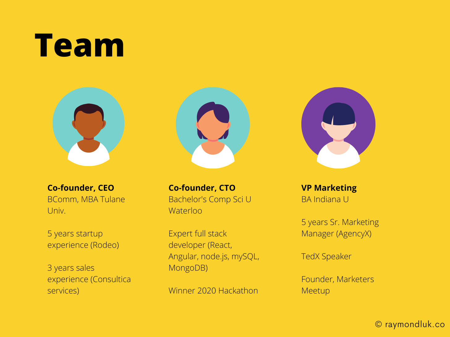
Imagine this is the founding team of Good Neighbors. They’re three people who decided to get together to build something they’re passionate about.

On the surface it looks good. We have a headshot, role and a brief bio that includes work experience, skills and educational background.
But if you read my post about how to create a better Team slide, you’ll know that this slide doesn’t answer three key questions:
- Why do you care?
- Why are you competence?
- Why are you committed?
Everything on the slide falls into the category of “FYI”. Nice to know but nothing special. Nothing that says “this is a team that really cares about solving this problem.” There’s no personality.
Version #2 - Passion and personality
The reality is that the Good Neighbors founders are all first timers who’ve only been working together for six months. Instead of searching for impressive facts to throw at the slide, I decided to lean into their passions.

The title doesn’t need to be boring
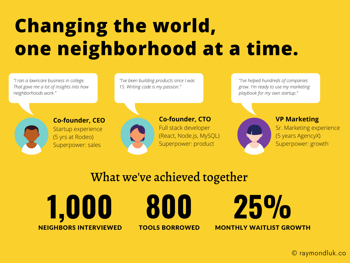
There’s no rule that says your team slide has to say “Team”. I decided to replace it with a headline that says how big our vision is and how much we care.
Use their own words
At the early stage investors need to understand the personalities of the founders. It’s the majority of what they’re investing in. So I added speech bubbles to let each founder say something about their passions.
Shorten the bio
I removed some things from the bio like education. It’s really not important for the pitch and can be easily found on LinkedIn.
Team achievements
The biggest addition I made was at the bottom where I added some metrics. Sure, these could also appear on your Traction slide. But placing them here gives investors a very important insight: this team can work together and achieve things together.
I can’t change the fact that they’re first time founders or the startup is only 6 months old. But there’s no reason all that work we put into customer development and building our MVP can’t be part of their bio. What they lack in previous startup experience is more than made up for with actual experience building this startup together. It hits all three things: caring, competence and commitment.


