The big reveal
In my last post I did a detailed teardown of a pitch deck from Goodlawyer. Since then I challenged myself to create a better version of their deck. I did not have access to any new information from Goodlawyer and I did not do new research.
If you’re impatient, click here to see the new pitch deck or scroll down for the before/after.
A special thanks to the designer, Philippe Gauthier. He did the visual design which ended up really helping me organize my thoughts. It also looks great! He’s available to help design and upgrade pitch decks. You can reach out to him here.
If you like this Pitch Deck Makeover and are interested in pitching and founder storytelling, please subscribe to a Leap of Faith!
My thought process
After analyzing the pitch deck last week, I gave myself these goals:
Communicate a bigger, bolder vision
Their original pitch deck exuded intelligence. There was a lot of data and statistics that said: “we are experts.”
But all that detail obscured a bigger vision. I wanted to dial up their vision to 11 so there was no mistaking this could be a billion dollar opportunity.
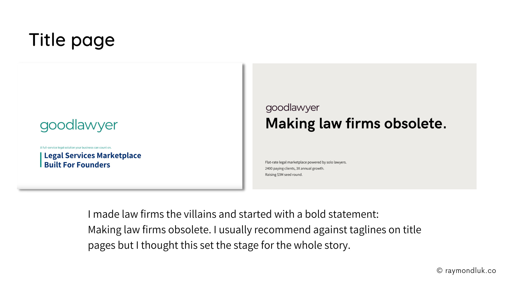
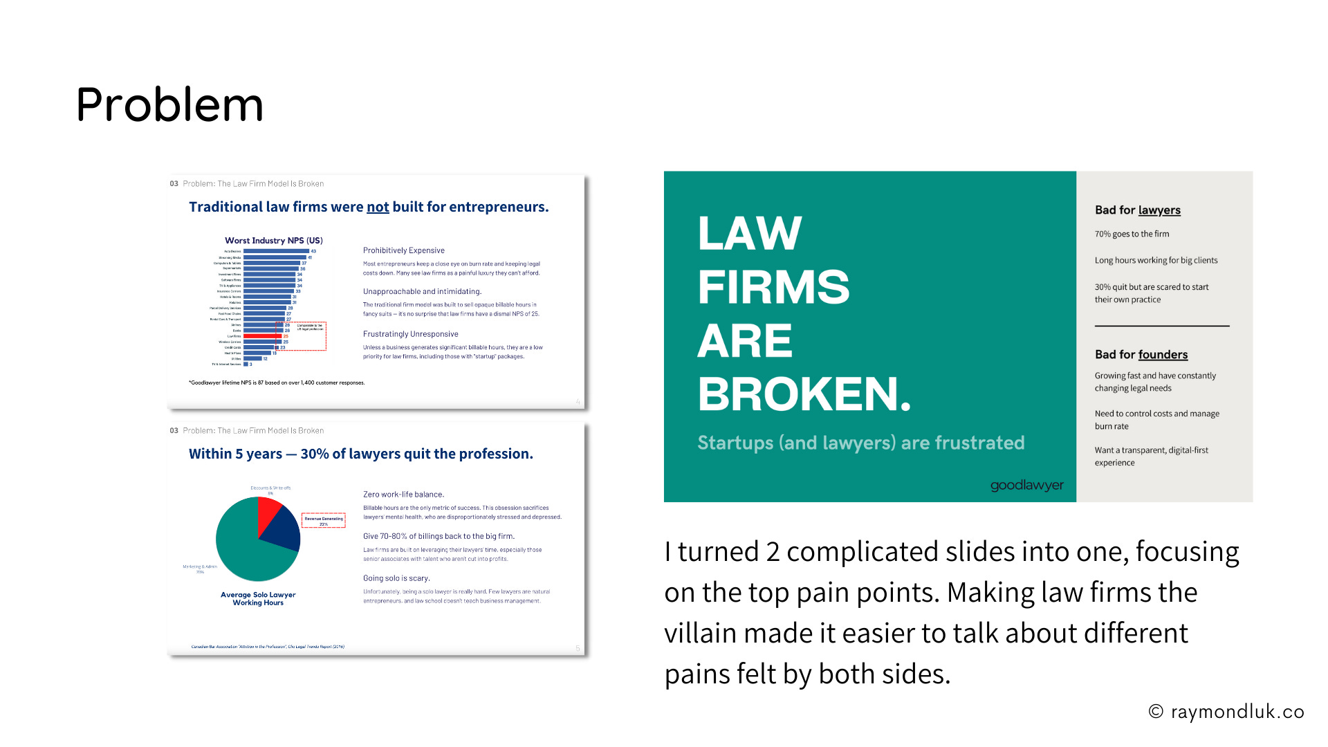
The most important change I made was to make law firms the villains. Having a villain to react to made it so much easier to explain why Goodlawyer exists. It’s more disruptive and says this is a much bigger opportunity for an investor.
The huge, bold titles don’t hurt either.
Be more decisive about the marketplace story
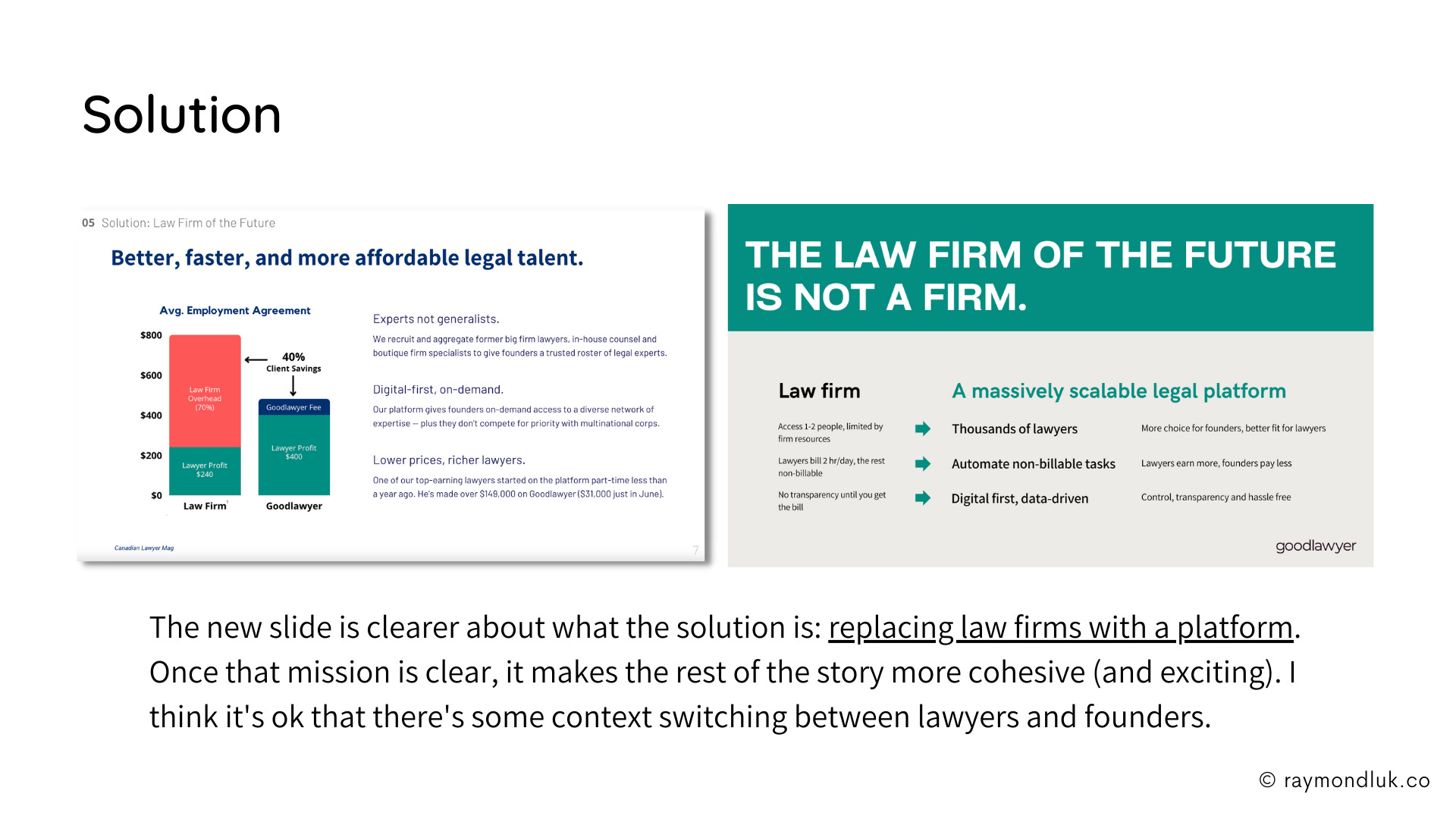
When you’re telling a marketplace story you can end up jumping back and forth between the two sides. This is boring and comes across as indecisive.
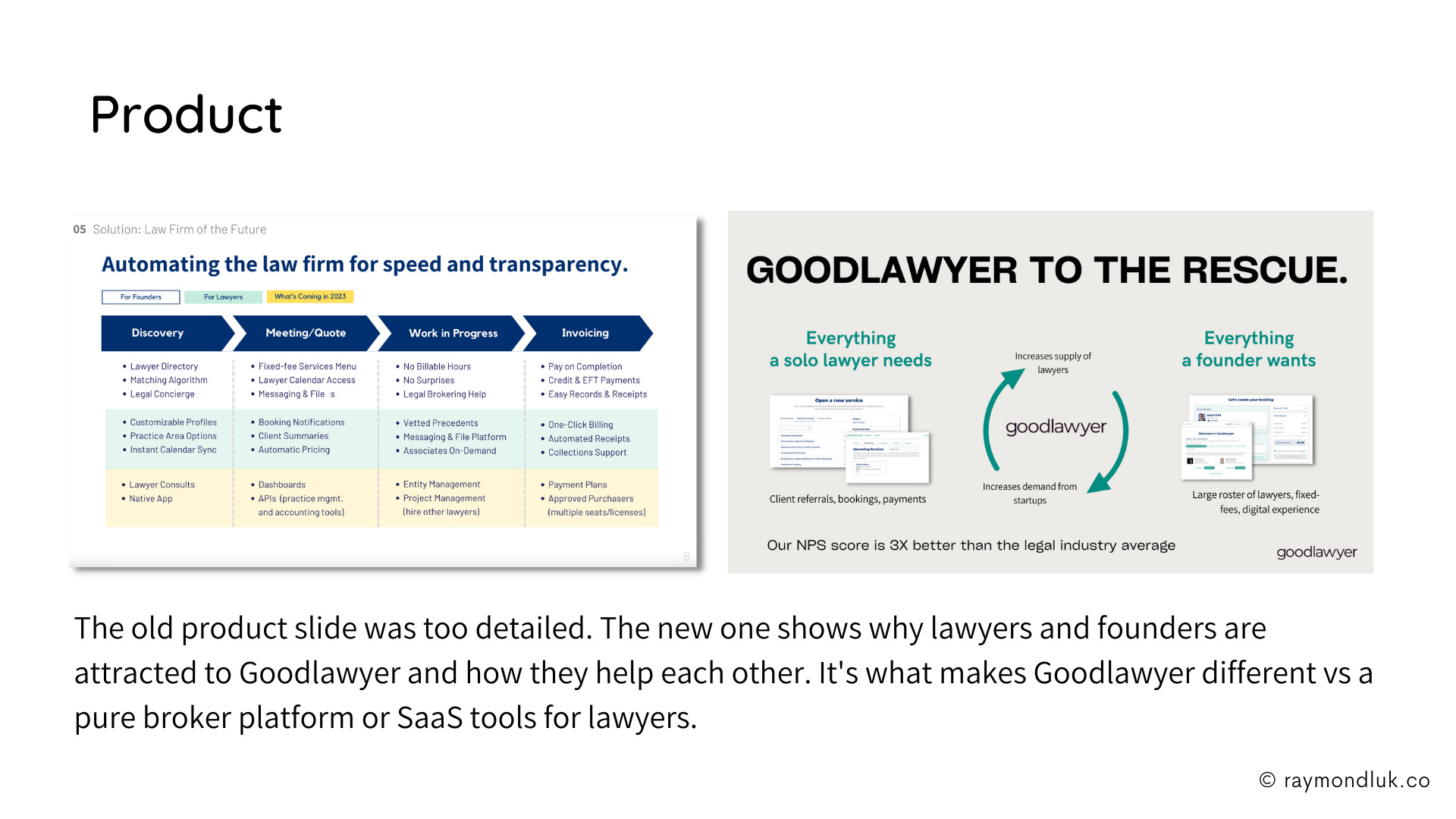
I focused on the fact that giving solo lawyers the flexibility they want creates a new supply of legal experts for startups. Those entrepreneurial-minded lawyers want to work with entrepreneurs.
Remove unnecessary details
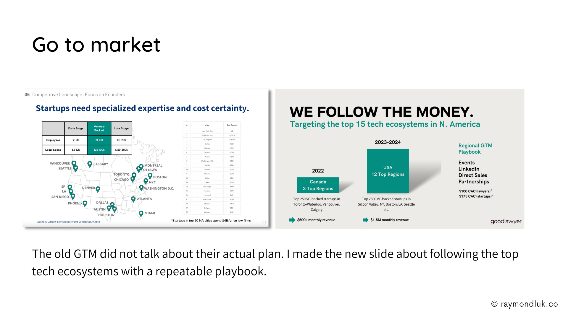
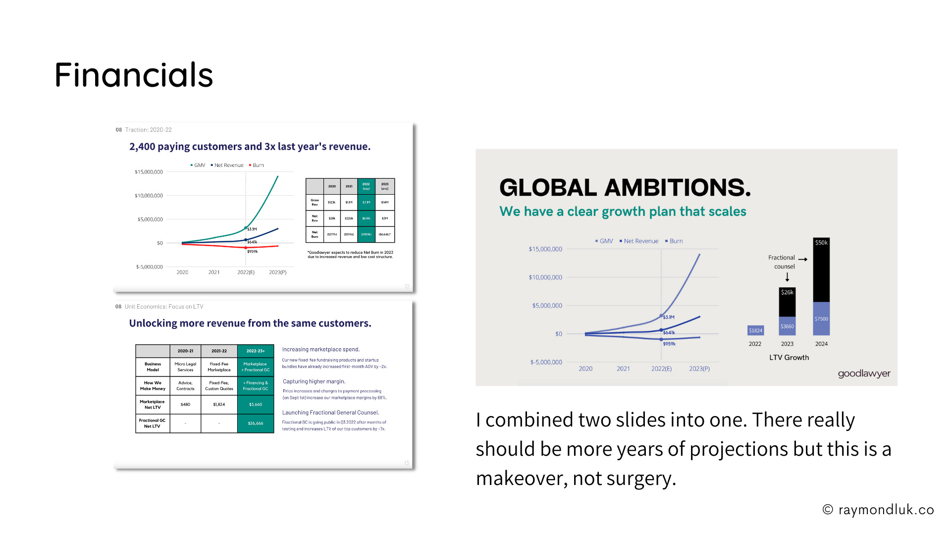
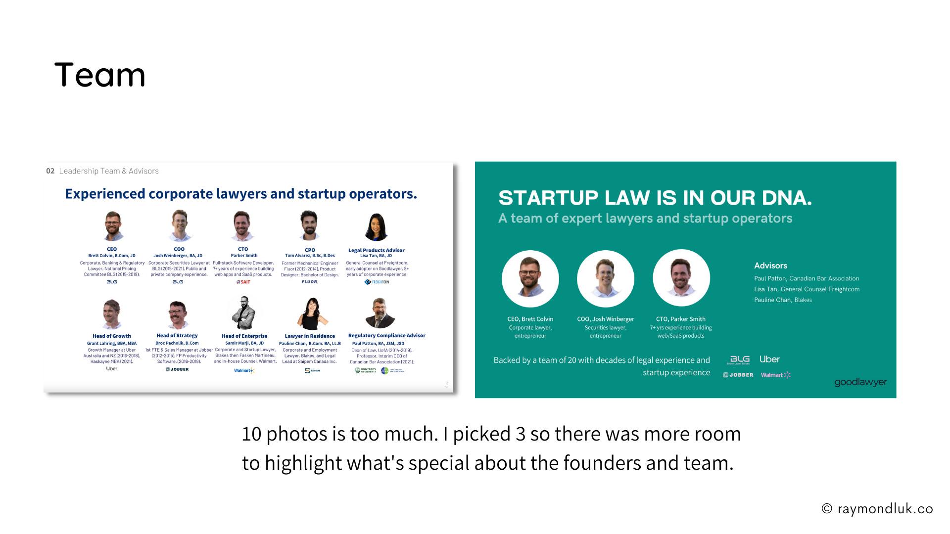
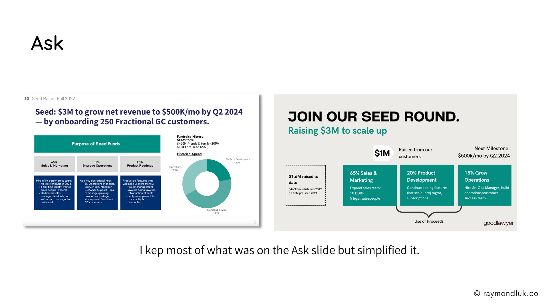
In the original deck the charts/maps/lists cluttered the slides. They distracted from the main point. I removed anything I felt wasn’t essential. Overall I think I removed 40-50% of the words.
Of course all of those words can be put back into the appendix or mentioned verbally when presenting live.
I wanted to refocus the pitch on selling a vision vs backing up an argument. I would be a bad lawyer.
Slide by slide comparison
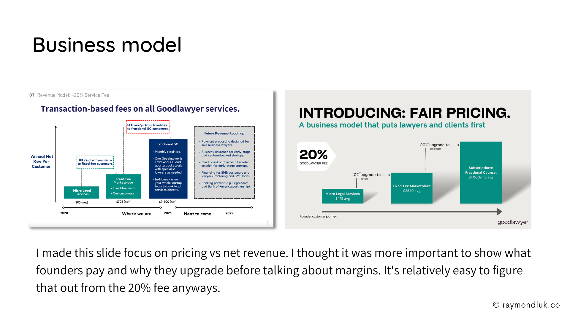
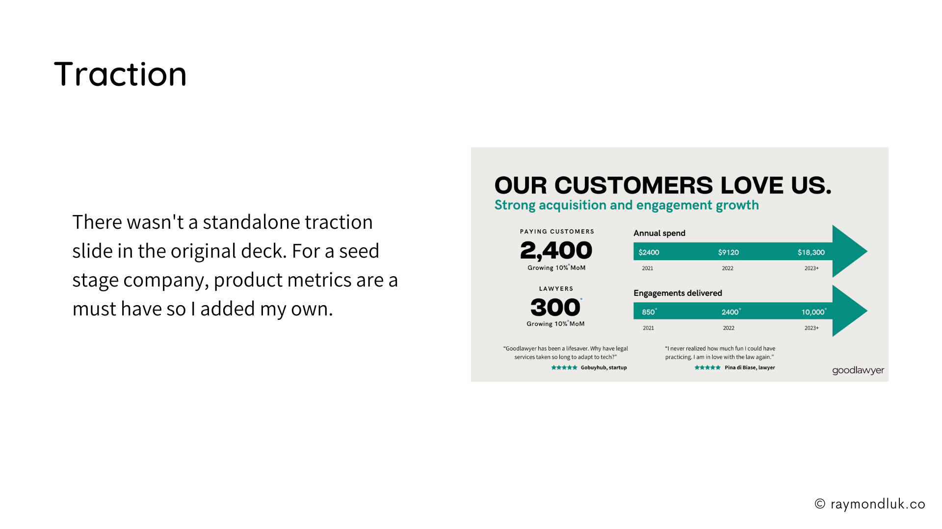
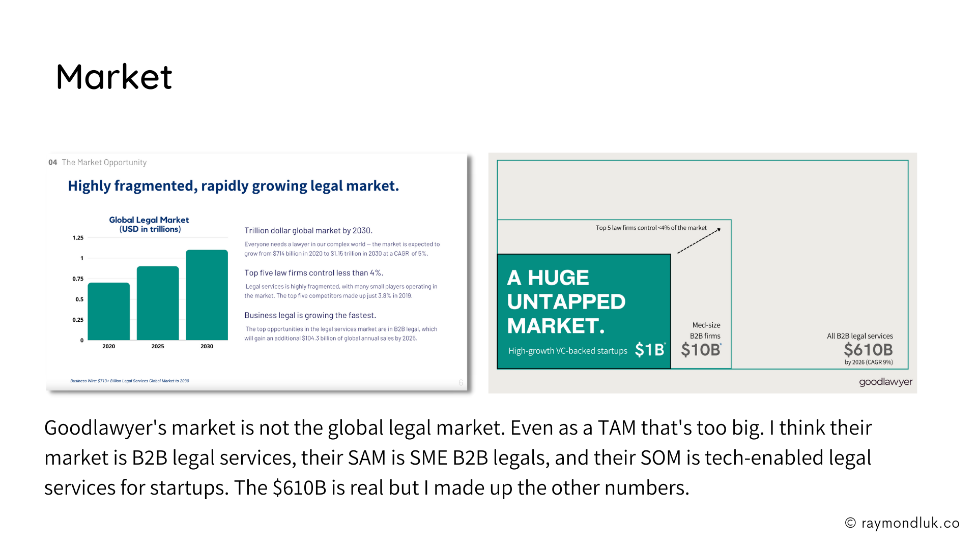
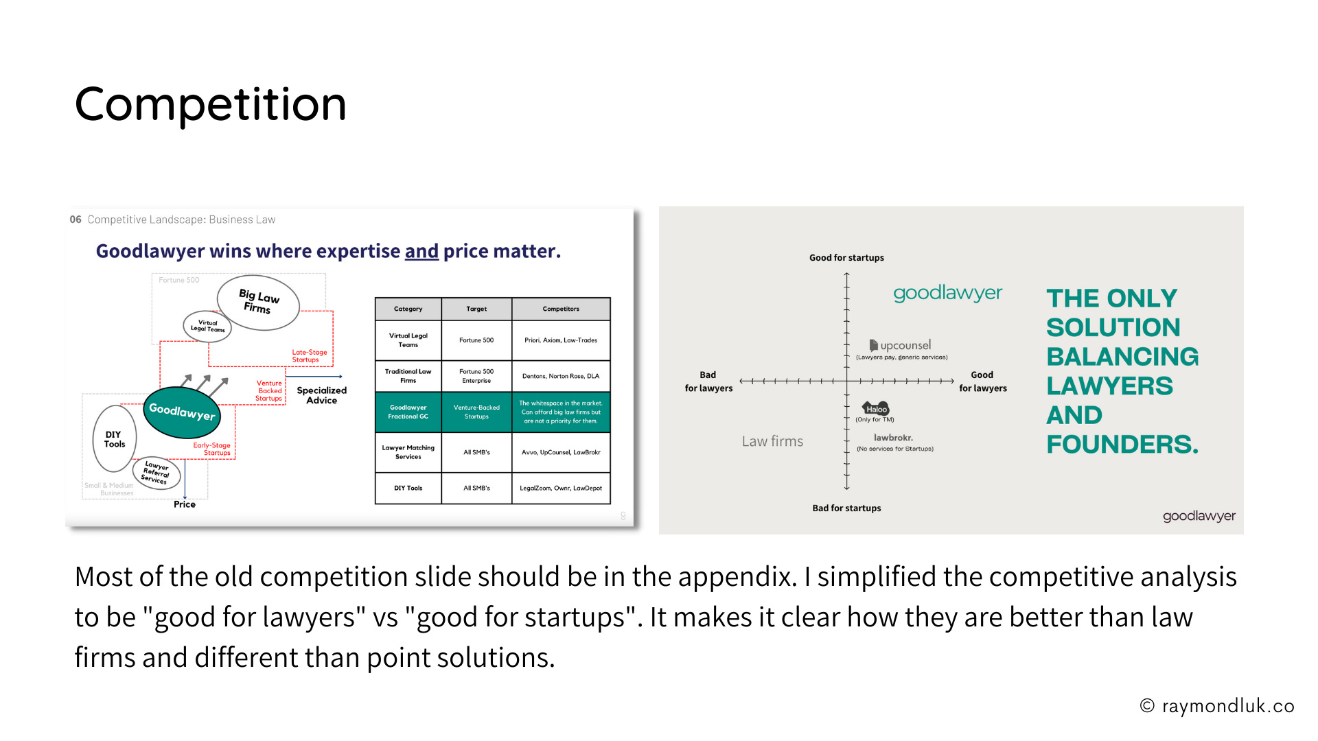
Here are all the slides so you can compare before and after. I have 12 slides vs the original 14 because I collapsed 2 slides into one for Problem and Financials.
I also changed the order. See my comments for more explanations.
An asterix (*) next to a number means I invented it. It’s easier to see in the full slide deck.
Was this pitch deck makeover successful?
Leave a comment if you have further thoughts, and reply to this email if you want to be considered for an upcoming Pitch Deck Makeover.


