
This is part 3 of a series that walks through the slides in a pitch deck. See Start With the Problem, and Your Startup’s DNA: The Solution Slide.
The product slide will complete the first ‘chapter’ of a good pitch. When you’re finished, the high level story should sound something like this:
We address these pains/gains for this group of people. Our unique approach solves those problems (and is way better than alternatives!) We’ve built something that works, and there’s more.
As I mentioned in my last post, your solution slide should be 100% focused on showing why you are unique, not what you’ve built. Now you’re ready to reveal your product, but don’t waste this slide with yet another screenshot.
Subscribe for free to receive weekly posts, a copy of my ebook Pitching a Leap of Faith, and invitations to my weekly Pitch Masterclass.
Key points I cover:
- The 4 most popular types of product slides
- Connecting to the problem and solution
- Beware the screenshot
- 20 examples of product slides
- Self-evaluation checklist.
The four most popular types of product slides.
There is no ‘standard’ way to talk about your product in a pitch deck, but here are the four types that are most commonly used.
- Mostly screenshots
- Text only
- Images + text
- Diagrams
I looked at publicly available pitch decks from well known companies and the models they chose:
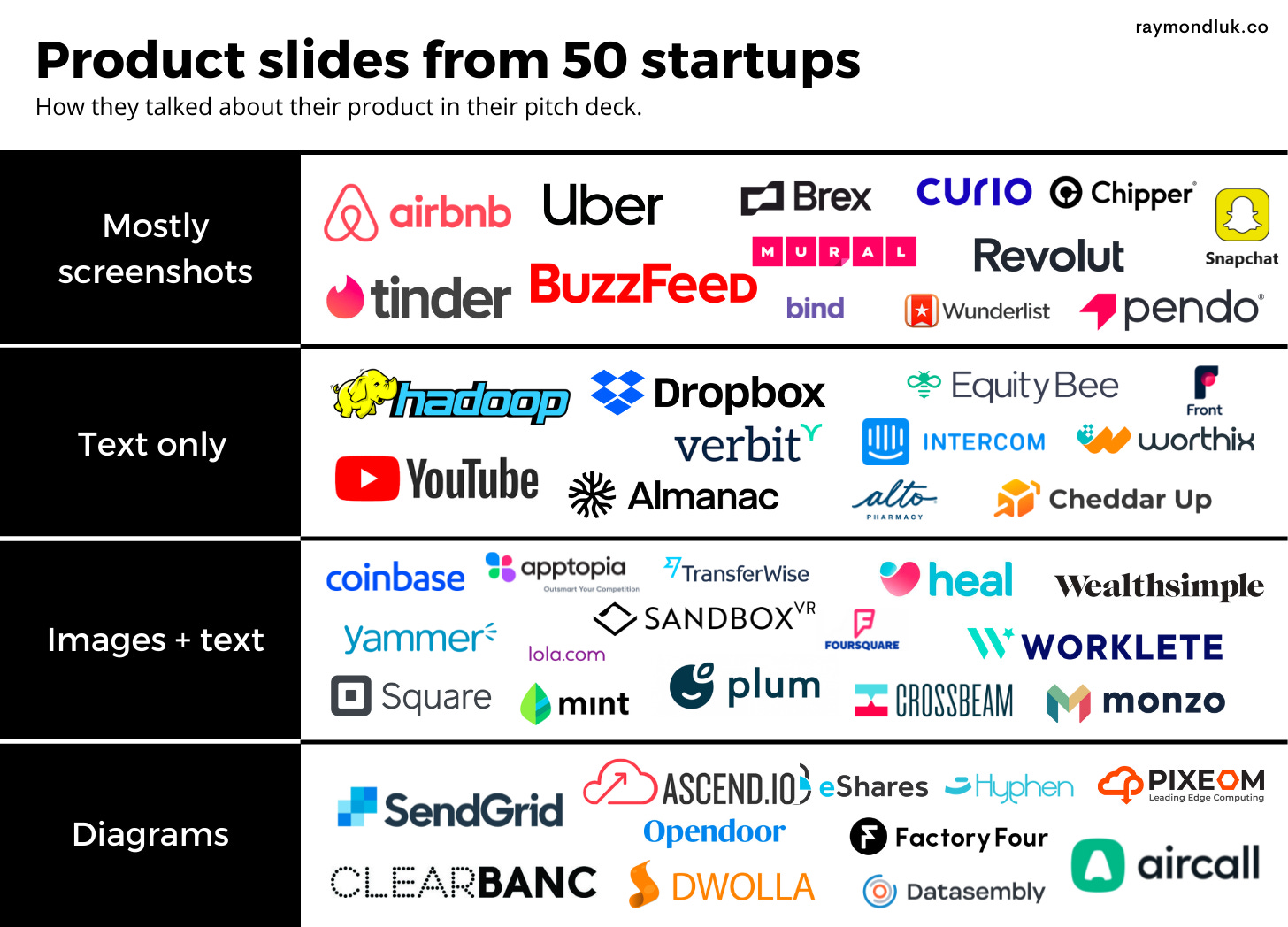
From my sample, there was a fairly even distribution and I think this would be true for all pitch decks. I show 20 examples further down in the post.
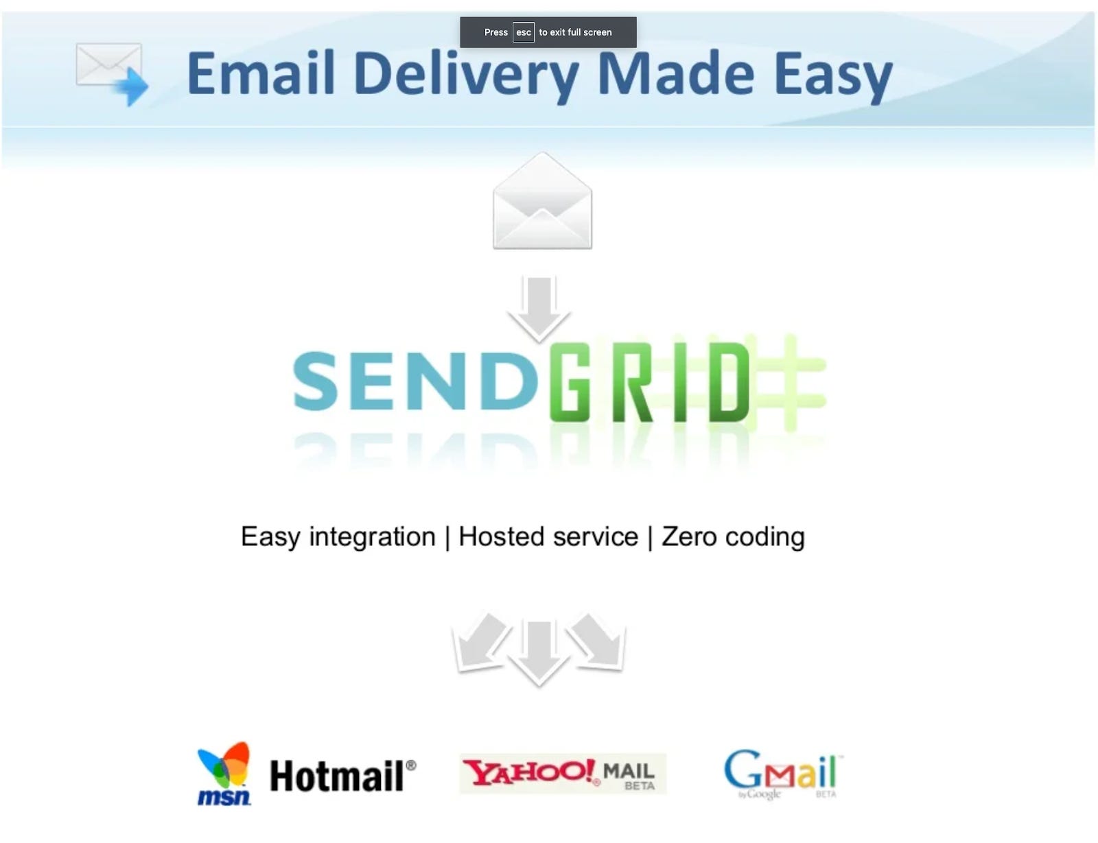
Consumer apps tend to use screenshots (eg tinder, Snapchat) vs B2B or infrastructure startups that favour diagrams (eg SendGrid, Factory Four).
But there is also an element of daring (my term) where you’re so confident in your story that you either don’t show your product (Dropbox, YouTube) or you only show a tiny piece of it (Brex). It takes confidence to pull it off but it can be great storytelling. Often the reward for all this hard work sweating over a pitch deck is the freedom to break the rules and be a little daring.
Connecting to the Problem and Solution.
Depending on your business, you may have one product slide or several. If it’s something novel or highly technical, you can spend more time educating the reader. But don’t overdo it and don’t lecture. As a rule, only show what supports the problem-solution fit you established earlier in your story.
The most commonly used models for product slides are actually pretty simple. But in most cases a lot of thinking has been put into what to show and what not to show. An easy way to strike the right balance between not enough and too much is to ask yourself how each graphic or bullet point connects to your problem and solution slides.
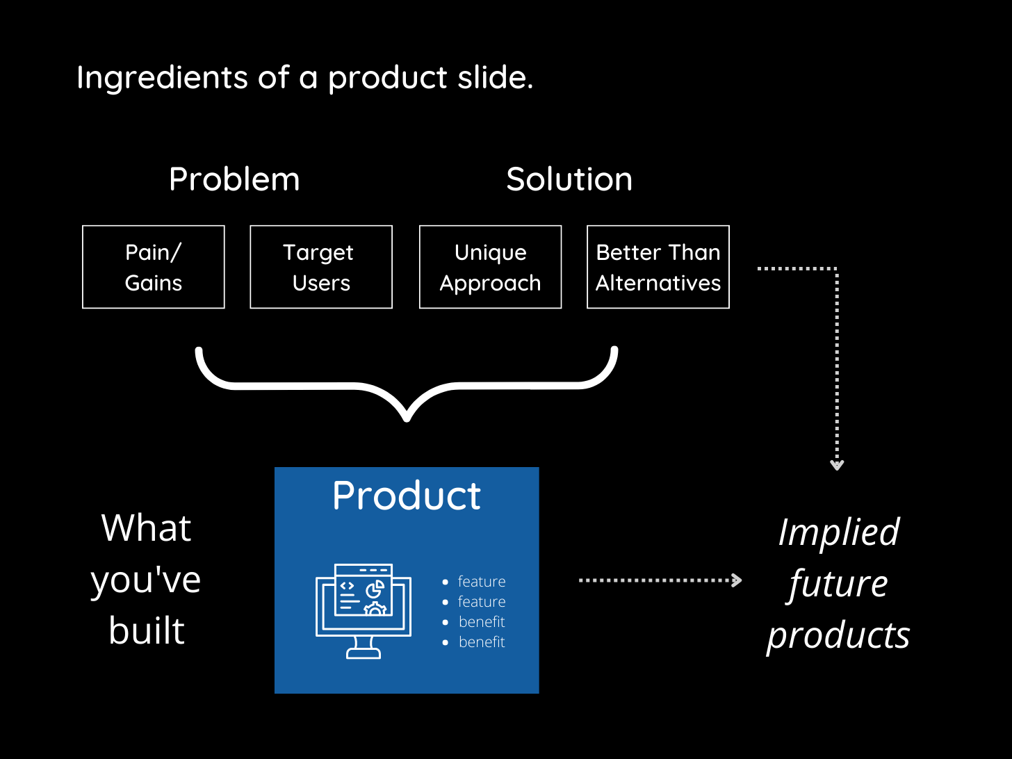
You do not need to explicitly state pains, target users etc. But you should use those ingredients to decide what goes in and what to take out without harming your overall story. When everything works together you’re not only showing what you’ve built but implying an even more exciting future product. You want to tell just enough of the story to lead the investor to say “I think this could be even bigger.”
Let’s say you built a selfie drone. A single image of your drone snapping a photo of people conveys the pain point, target users, unique approach and alternatives. No text required. If camera quality is your key differentiator, you can say that in your title or a bullet. You really don’t need to list other obvious features.
If you are a voice platform for e-commerce, show an animation of a sample script. For more daring just play an audio recording over your slide. Exclude all the scaffolding of your product and just show (or play) the part that will make the investor want to know more.
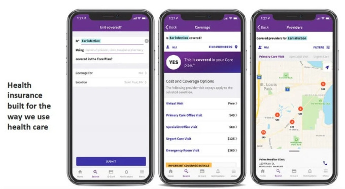
Beware the screenshot.
I feel the need to spend a little time talking about screenshots because almost everyone overestimates how important they are to a pitch deck.
Your pitch deck may not need a single image of your product.
You read that correctly. In the story of why you built this company, pictures of your current product are not that important.
Say you’ve built an app that helps distance running to train better. Ask yourself if a screenshot is the best way to communicate your big vision. Something small enough to fit on a slide is going to look like every other screenshot ever made. You probably use the same stock photo as your competitor. Here’s an example:
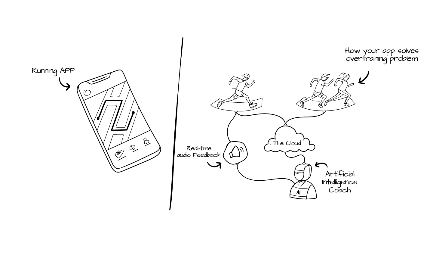
Having a generic screenshot forces you to add bullets explaining why someone should care about the image you’re showing. But showing the platform as a whole shows how the parts of your product interact (especially with the user) and makes it easier to envision bigger/better ways it could be expanded.
20 examples of product slides.
Screenshots
A screenshot-heavy approach is good for visual storytelling or physical products but, again, be careful: screenshots are not self-explanatory. Also, when your pitch deck is shared between partners at a VC firm, you aren’t there to do the voiceover (do not even think about adding voiceover to your pitch deck).
Bind
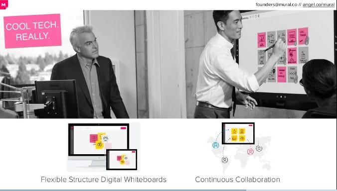
Mural
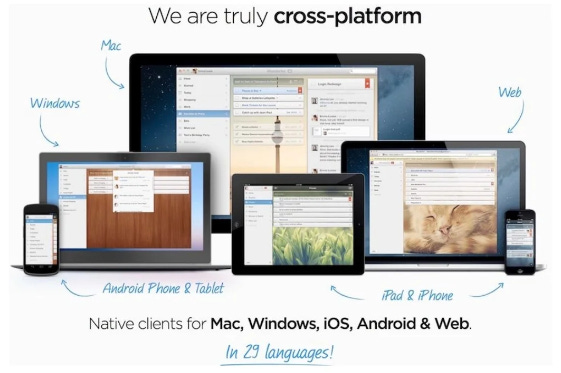
Wunderlist
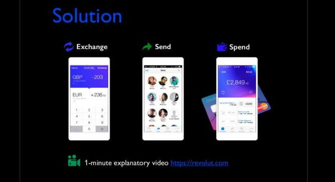
Revolut
Tinder

Text only
Many products can be effectively described with words, sometimes even more effectively than images. This approach is good for focusing on benefits, not features. Or where a screenshot does not do the product justice. Be careful not to use too many words and keep in mind that without images, your words have to be very, very well chosen.
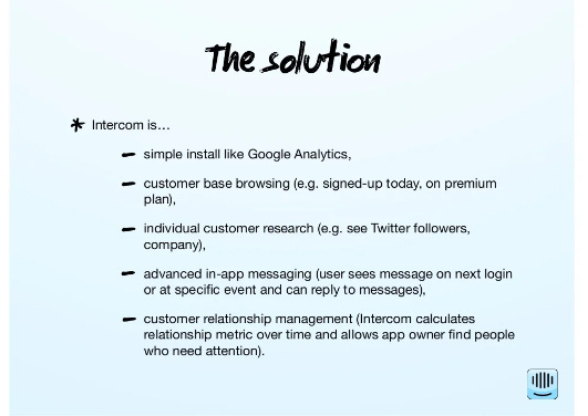
Intercom
Almanac

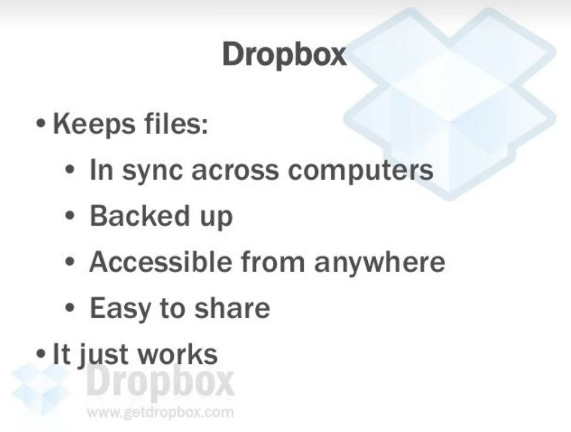
Dropbox
Hadoop

Front
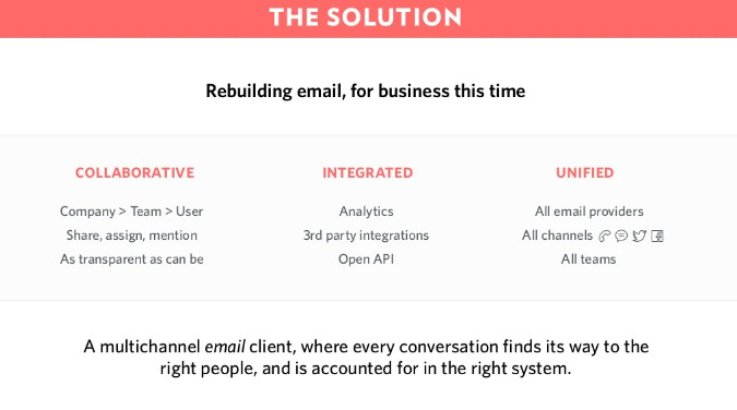
Image + Text
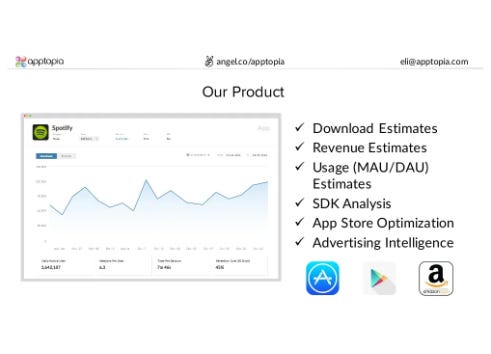
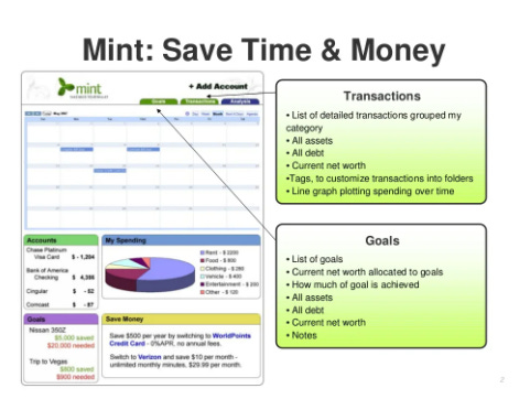
This is probably the Goldilocks zone for most startups. Show one image (shows it’s real, you built something) but use bullets/text to tell the story. The key is finding the right balance between image and text. It’s almost always better to zoom in on a snippet of a screen to focus on just what’s important. Don’t over explain in the text, let them work together.
Apptopia
Plum

Mint
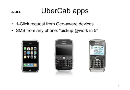
Uber
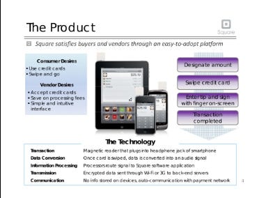
Square
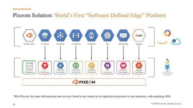
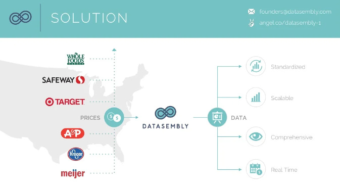
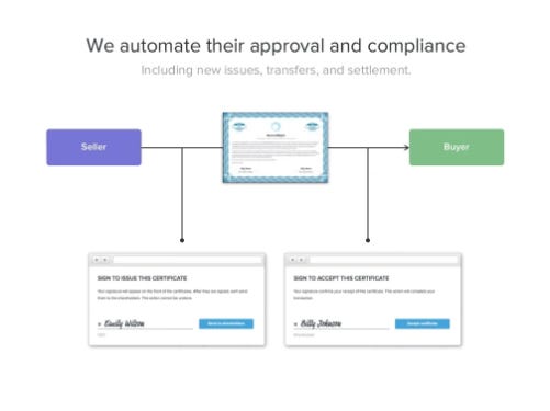
Diagram
This is the go-to for business process startups, APIs, or deeptech solutions where it’s better to explain the process (or the product has no UI). But it can also work for any product where showing how the system works as a whole tells a better (and often bigger) story than screenshots. Be careful not to make this too complex.
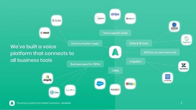
Aircall
Sendgrid
Pixeom
Datasembly
Carta
Checklist
- Does your product slide connect to the problem (pains/gains, target user)?
- Does your product slide connect to the solution (unique approach, superiority to alternatives)?
- Have you removed anything extraneous that isn’t part of your unique story?
- Have you chosen a layout/model that suits your company?
- (optional) Is there an element of daring?


